
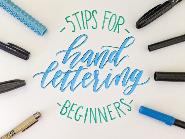
So you’re thinking of learning how to hand-lettering or calligraphy, let me give you a few helpful tips to get you started on your journey! We have also included a free download at the bottom to help get you started.
Tip #1 – Find the right hand-lettering utensils
What Paper to Use?
Really, any paper will work. I have used printer paper, lined paper, and more. When practicing I would recommend dot paper. Dot paper is great to help you stay consistent in letter-size, angles, and spacing. One thing that can take your hand-lettering from okay to great is being consistent in those three areas. Dot paper will be a great tool to help with that!
Which pen is best for you?
There is a HUGE array of options that you can invest in with hand lettering. If you are just getting started you probably don’t want to drop any big dimes. In the video below you can see the different choices of pens, I have tried. There are SO many out there, but I believe that most of these land in the affordable range. The best part is most of these you can find at Micheals or Hobby Lobby! I have the pens in the video in the order as I have them listed below. I did try both Tombow Fudenosuke Pens, keep that in mind for your reference.
Favorite Hand-lettering Pens:
Tombow Dual Brush – $14.99 (sale price) for a 10 pc. set – Each marker has two writing ends, both the brush and hard tip. This is great for combining script fonts and type fonts. I got mine on sale at Micheals, and Amazon carries them as well. You can purchase individual markers at Micheal’s
Tombow Fudenosuke Brush Pen -$9.99 for a 2 pack – You can purchase in a two-pack from Micheals. One has a soft nib (tip) and the other is hard. The softer nib still holds firmness but allows for a little more flex in your writing. In the video above, I tried the soft nib first, then the harder nib. You can also purchase a 3 pack from Amazon.
Pentel Touch – $2.99 Individual Marker – I really liked this one option, there is good flex in the tip but not too much. I got mine individually at Micheals, but you can also buy them on Amazon.
Crayola Marks Standard Tip – $0.97 10pc set -From a money standpoint this is the best value! These markers are great for beginners not looking to invest too much upfront. I found these for super cheap at Walmart! However, if you’re a bigger fan of online shopping you can definitely find these on Amazon too.
Crayola Markers Super Tip – $3.97 for 20 pc. set – Great for beginners not looking to invest too much upfront. I like these slightly better than the standard Crayola markers. Walmart has these for a pretty good deal right now, but you can find them at any store or online.
Micron – $3.79 for individual pen – Great for adding detail on letters, and for adding contrasting thin letters. These pens come in different tip sizes. I like the Micron 01 size the best. You can buy sets at Amazon, or purchase them individually at Micheals.
Sharpie Stained Brush Marker – $12.29 8 pc. Set – This one surprised me! These markers are actually fabric markers. When using it, I noticed it does a very cool ombre effect dependent on the pressure. The heavier the pressure, the darker the color. I ordered mine on Amazon, but Micheals does sell the markers individually for a bit cheaper.
Artline Stix – $18.35 20 pc. Set – These markers are probably my least favorite. They are a step above Crayola markers, but the price change is significantly more. Personally, I also do not like the grips on the Artline. They are a lego looking design so that the markers can stack, but they hurt my hand. You can find these on Amazon.
Tip #2 – Understanding the hand-lettering look
Hand-Letter Design
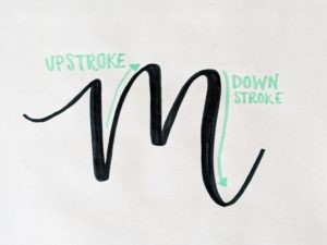
Hand-lettered words all follow a very similar pattern. No, I’m not just talking about cursive. I am actually talking about the thickness in the letters and where the emphasis is placed.
Hand-lettered words have the emphasis or weight on the downstrokes of each letter, while the upstrokes are thinner. There are the occasional exceptions to this, but most hand-lettering you see will follow this pattern.
Achieve the look:
You can achieve the look in one of two ways. The first way requires you to use a brush pen or Crayola maker. It will be very difficult to do with just an average pen. Whenever your pen is going from top to bottom of a letter (downstroke) you add more pressure. The extra pressure will thicken the line. Likewise, you release the pressure when going from bottom to top (upstroke) of a letter. If this is difficult, or you are having a hard time with consistent pressure, do not fear, there is another option!
The second way you can achieve the look is by doing a more “faux” hand-lettering. Most often this is the method I use when painting large signs for commissions because I want to ensure consistent work for the customer. To do this you write out your word with the same amount of pressure the whole way. Then you can go back and add thickness to each of the downstrokes individually. This is a great way for beginners to start and to get practice with lettering. The video below has an example of what this looks like!
Tip #3 – Practice
Practice makes progress. I’m a firm believer that if you strive for perfection, you may end up frustrated and put down the pen for good. Instead, strive for improvements! The single best way to see improvement in your work is to practice, practice, practice!
Before you bite off too much, practice individual letters. I taught myself hand-lettering by repeating each letter of the alphabet over and over. I would find a look that I liked and would repeat it 10-15 times. Then I would move on to the next letter.
Once you are comfortable with individual letters, start trying words. There are a lot of photos out on Instagram, Pinterest, and Google that you can use as inspiration. Find a design you like and imitate it. After you are comfortable with that I suggest picking a quote, a verse, or song you like and use that as your inspiration.
Tip #4 – Combine writing styles in your hand-letter design
One way you can really spice up your hand-lettering is to incorporate different fonts. I love mixing type fonts with script fonts. Done right it can be very appealing to the eye. It also makes it easier to follow what a quote says, or to see what is being emphasized.
Tip #5 – Utilize free hand-lettering resources, and paid ones too!
We live in a time that so much is accessible through the internet. If you are really wanting to improve your hand-lettering, you are just one Google search away from finding a plethora of guidance!
For the visual learners, I would direct you to Let’s Make Art they offer many free tutorials that you can follow along! You can also find free lettering sheets here to download, we also have the lowercase sheets listed on Etsy for download, just click here. If you are willing to invest some money, there are great tutorial classes on Skillshare that you can pick to best fit your needs.
Free download – Hand Lettering Capital Letters